Relay Financial came to me looking for a way to differentiate themselves from other financial products and “modernize” small business banking.
The team at Relay had hired an external agency to provide them with a design. However, the founders had encountered a problem:
The users were having difficulty understanding the “modern” interface.
This meant users were unable to discover or learn how to use the interface for themselves without contacting support. This was because each feature contained similar tasks that were structured slightly differently from the last—preventing a small development team would need to consult a designer each time they wanted to add new functionality.
Product development was also encountering their own set of trouble. The company was 2 developers at the time with no one to represent design. Scope was important because it was a small team and with a tight 6 month deadline to get to something users would pay for.
The first thing we did together was identify where the weaknesses of Relay as a product were.
It wasn‘t that it didn‘t look “good” per-se but it was awkward at times to use.
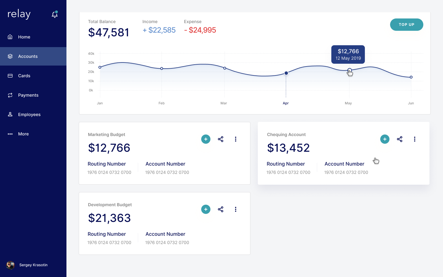
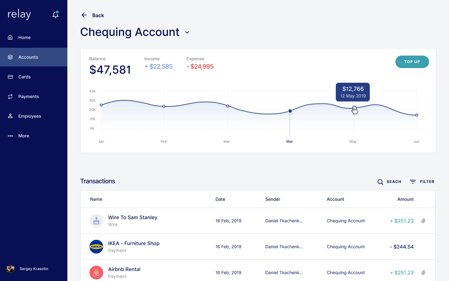
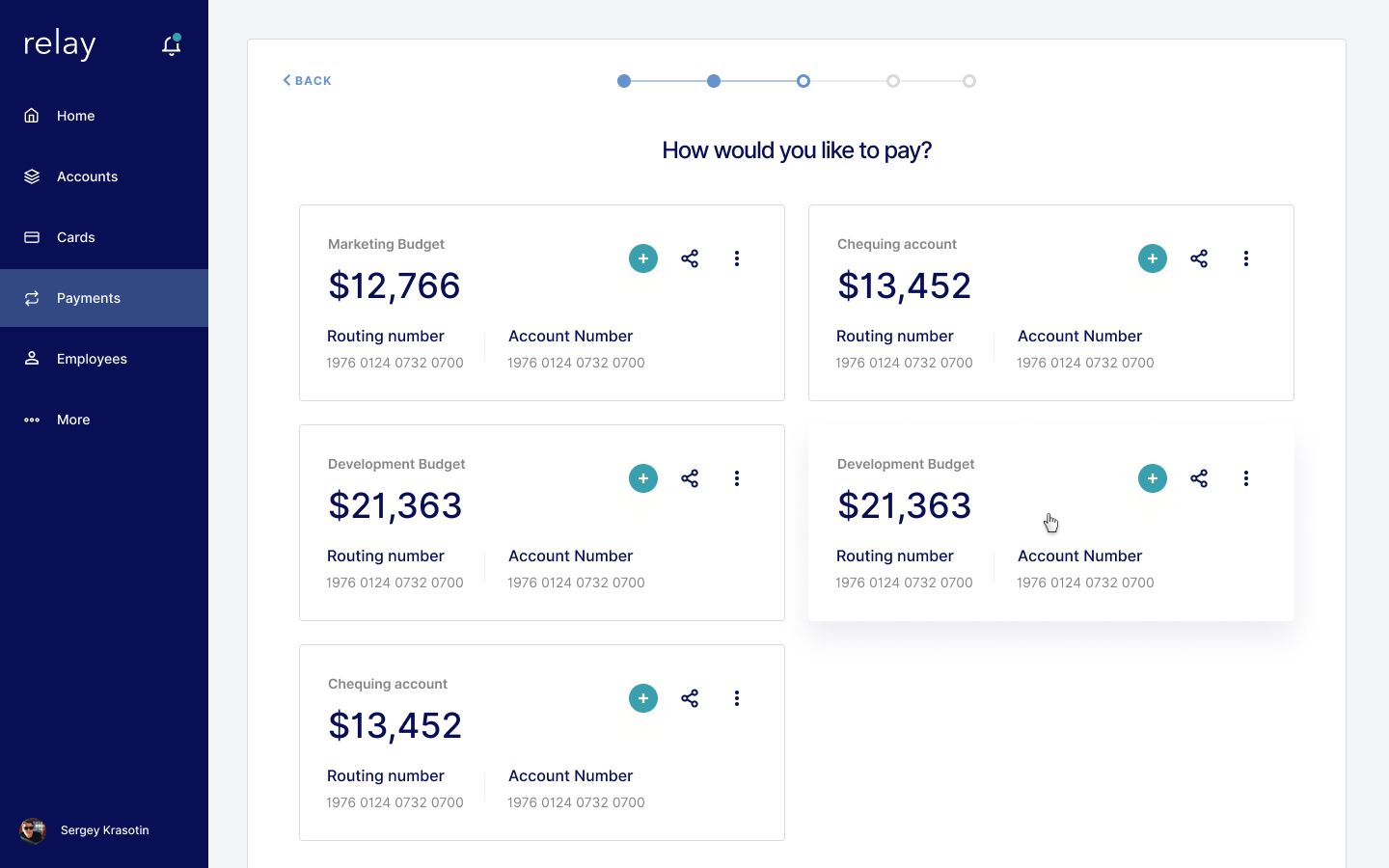
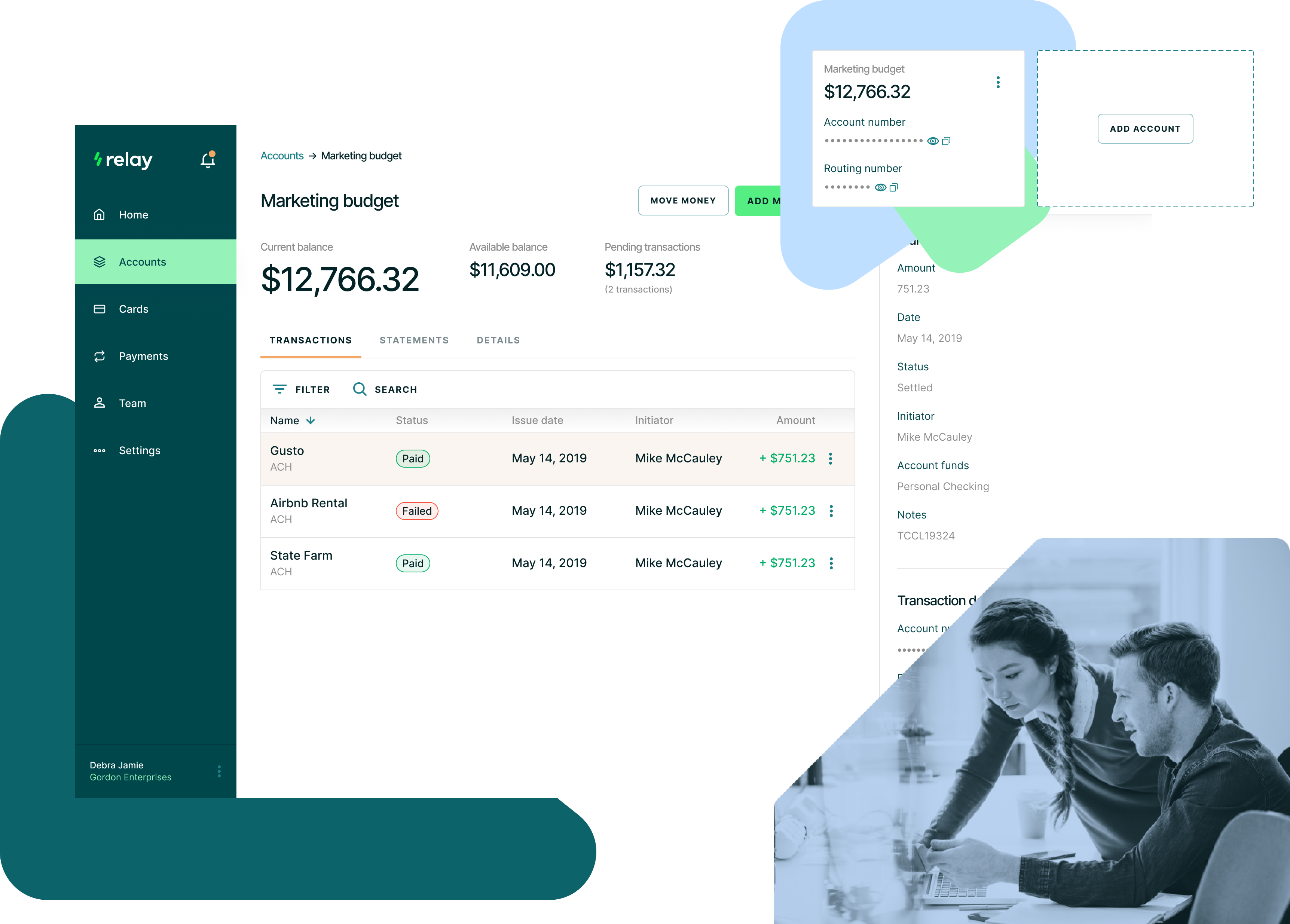
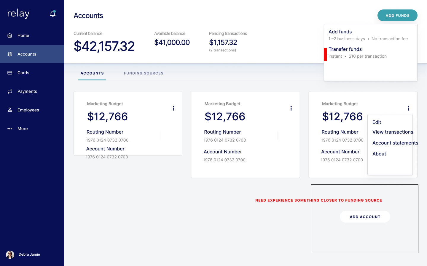
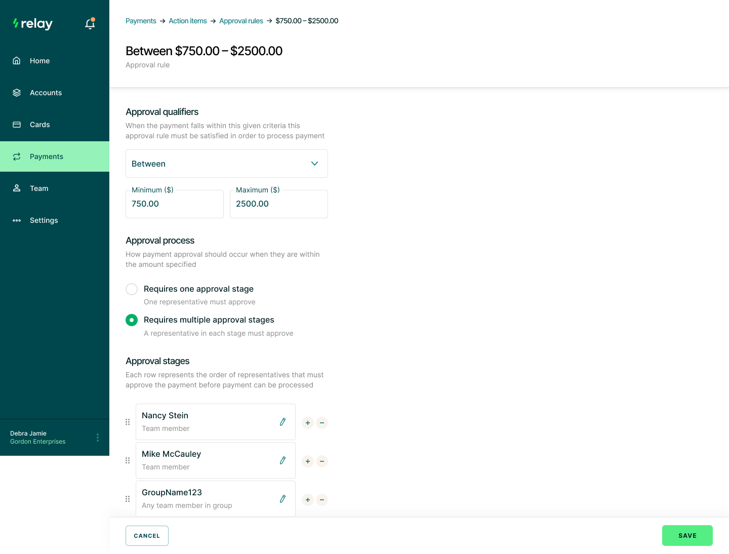
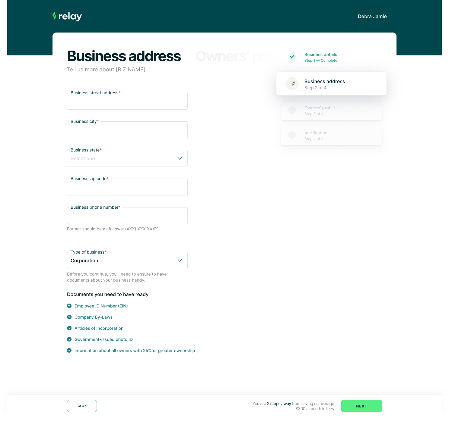
Next was to establish a heuristic approach to Relay‘s information architecture.
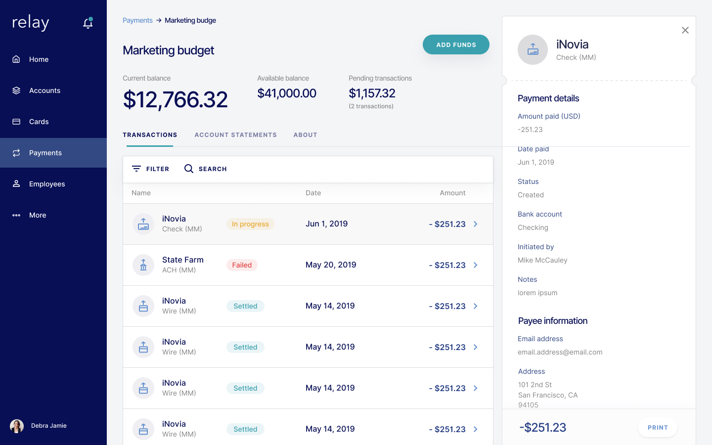
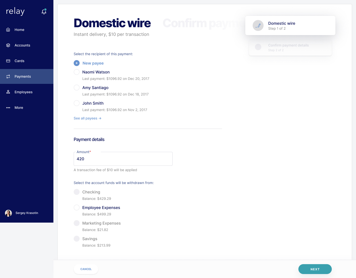
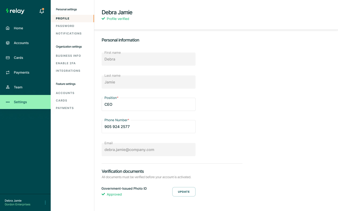
I introduced standard layouts for entry pages and whenever a new entity was created. This provided the application with a go-to solution that users can navigate without relearning the interface each time they need to perform a new task.
I get a strange sense of satisfaction taking a nice looking UI and making a decision that would take the design from “Dribbble-worthy” to practical. The same can be said for an overtly-complex UX, but there‘s something extra special with the “Dribbble-worthy” ones. It doesn‘t make for good portfolio screenshots but it keeps customers.
Something worth noting; While the mobile apps also received some updates as well bandwidth was limited. The founders opted to focus on improving the web experience first and foremost with our limited cycles. Ultimately that meant the mobile app didn‘t receive the same attention as the web experience.
With a product direction established, we began to add features and fix UI inconsistencies.
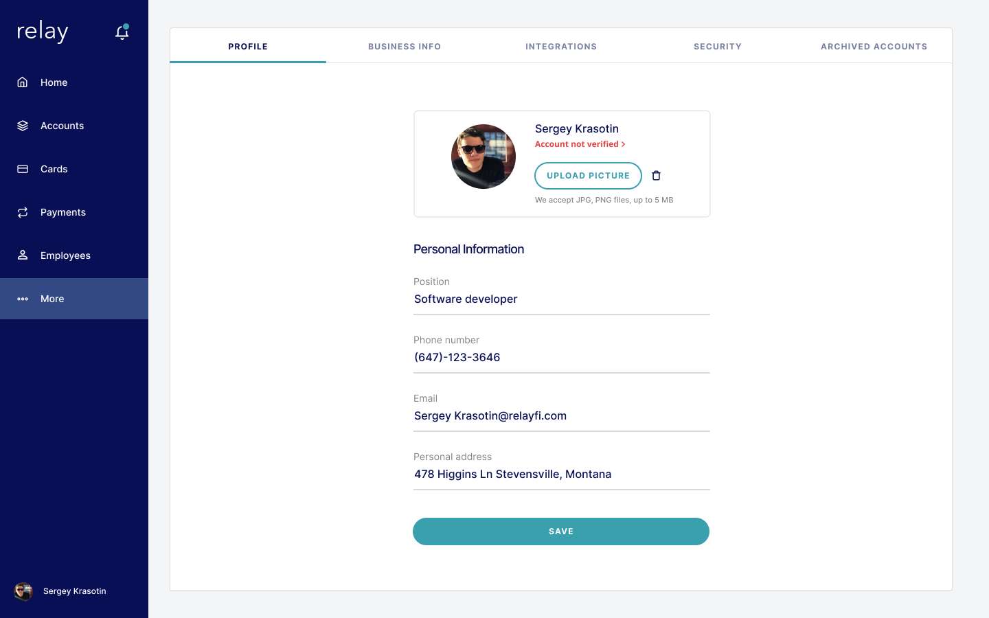
We brought on a brand designer to refresh the logo, brand colours, etc. I defined requirements for how we would meet colour contrast compliance (i.e. WCAG 2.0). We made light considerations for colour blindness by removing the applications' reliance on only using colour to identify a concept/status.
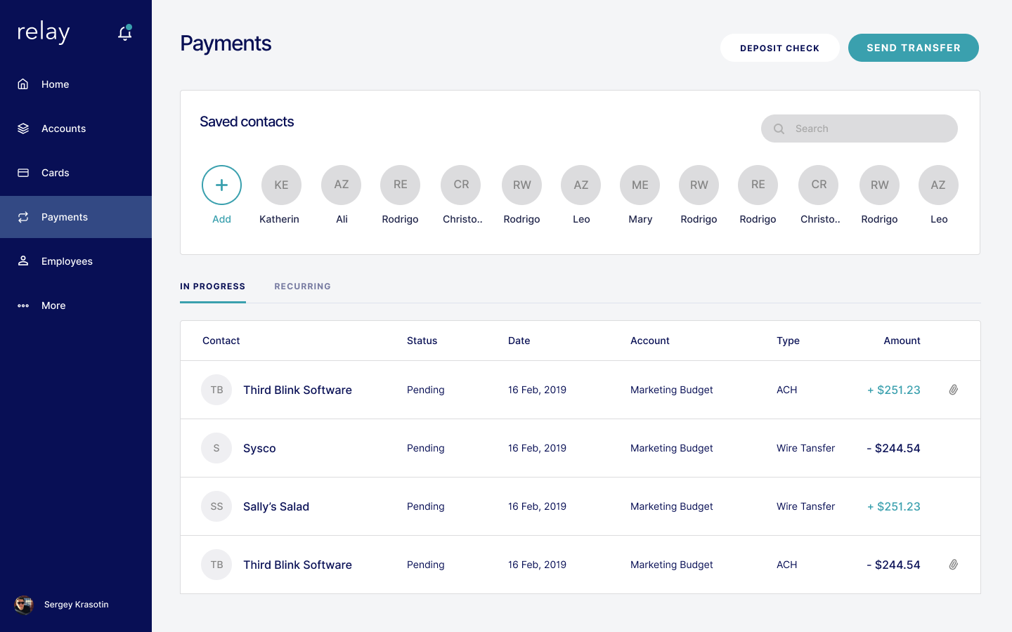
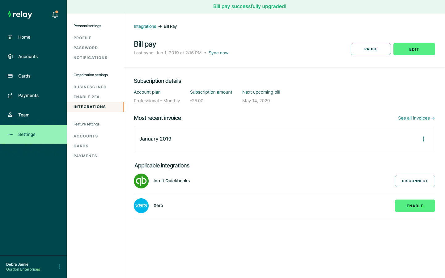
At the same time we were introducing new features into Relay. It was a good test on whether the existing design layouts/elements could continue to solve the users needs. One such feature was introducing a triaging system where different organizations could have different triaging needs depending on their size.
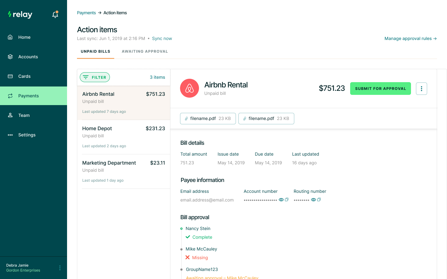
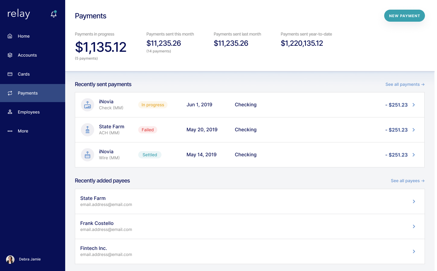
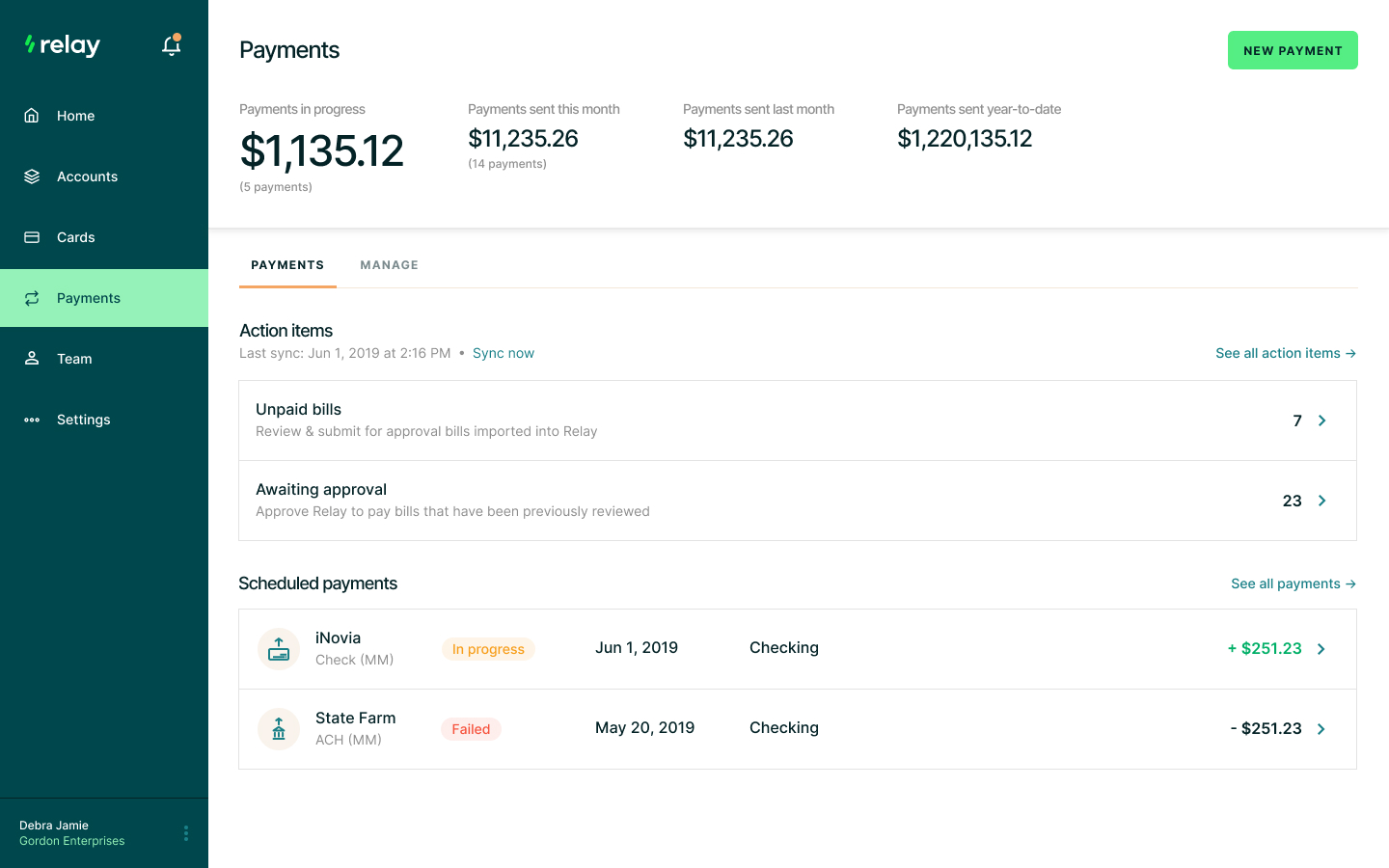
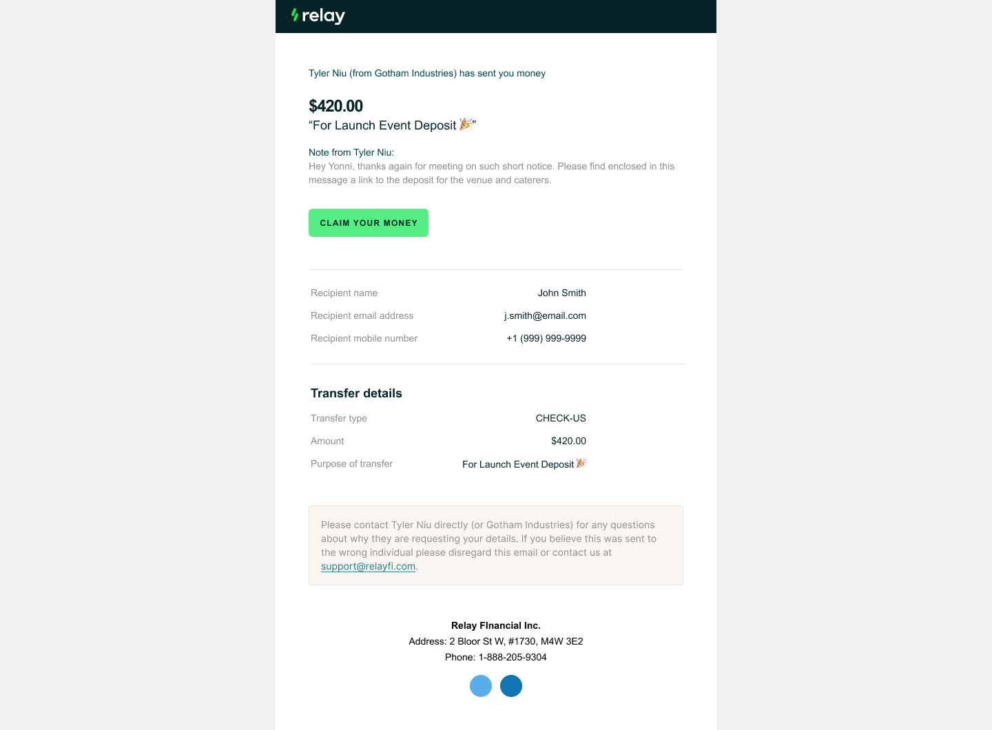
Other notable new features included a solution for single-transaction transfers, and a robust onboarding experience.
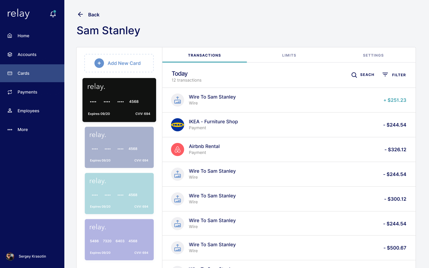
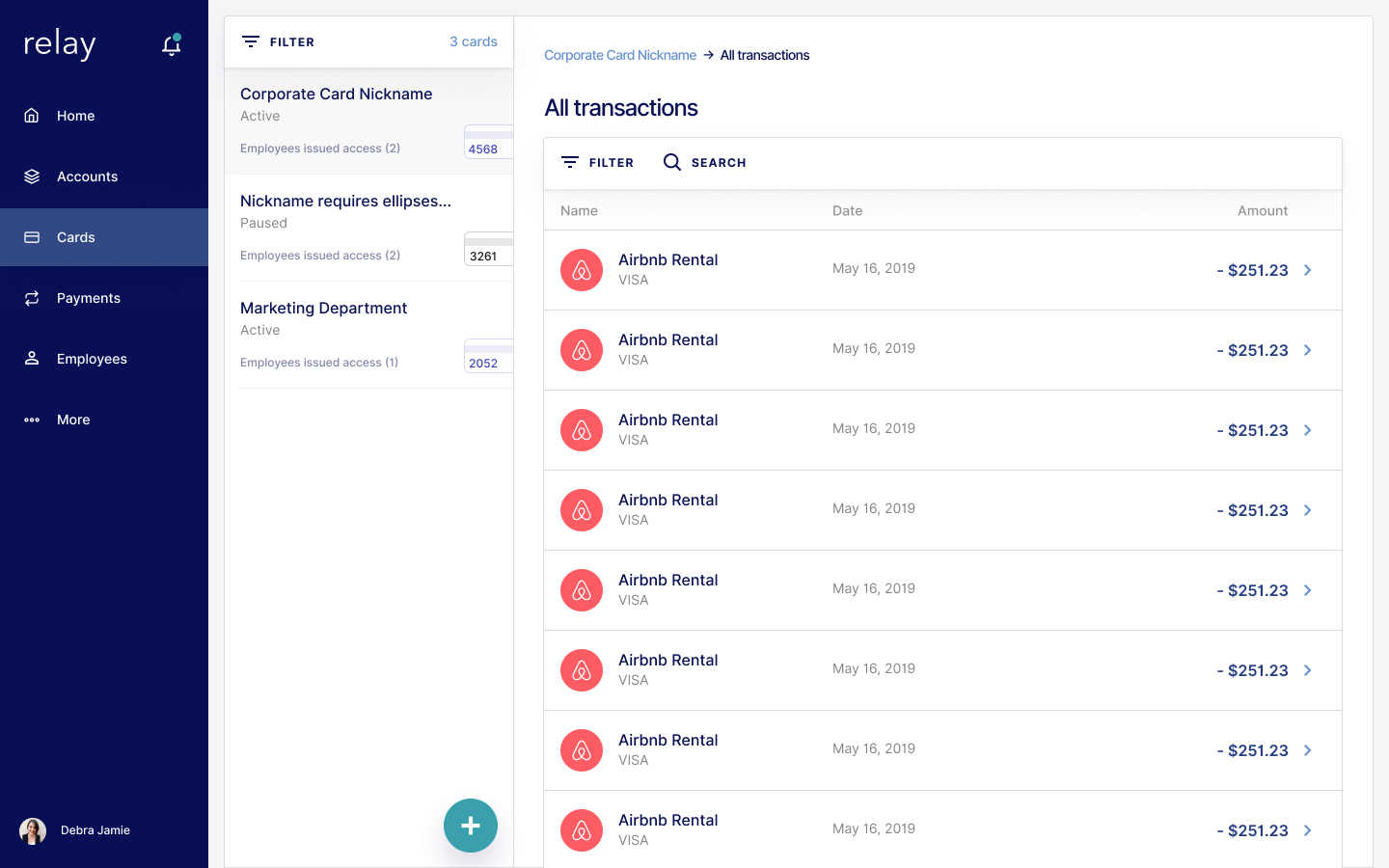
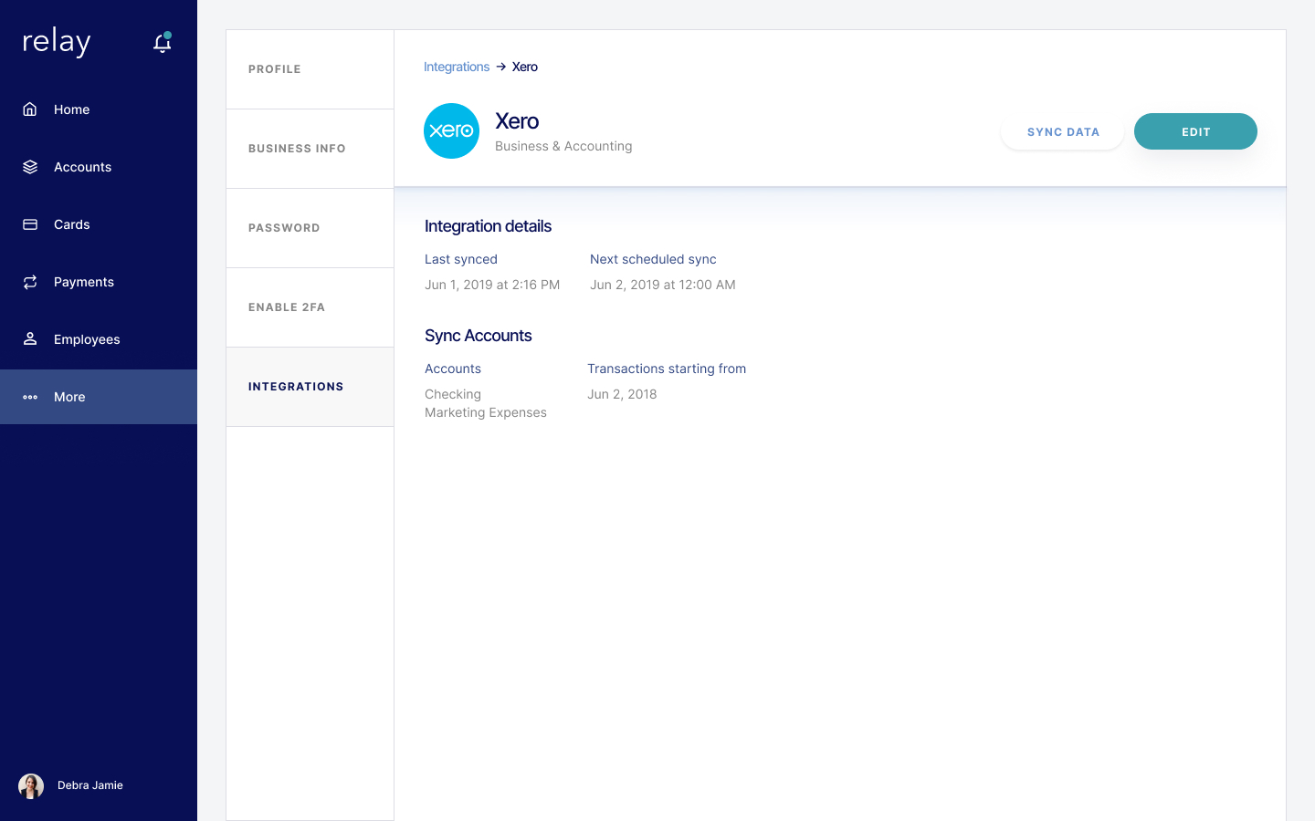
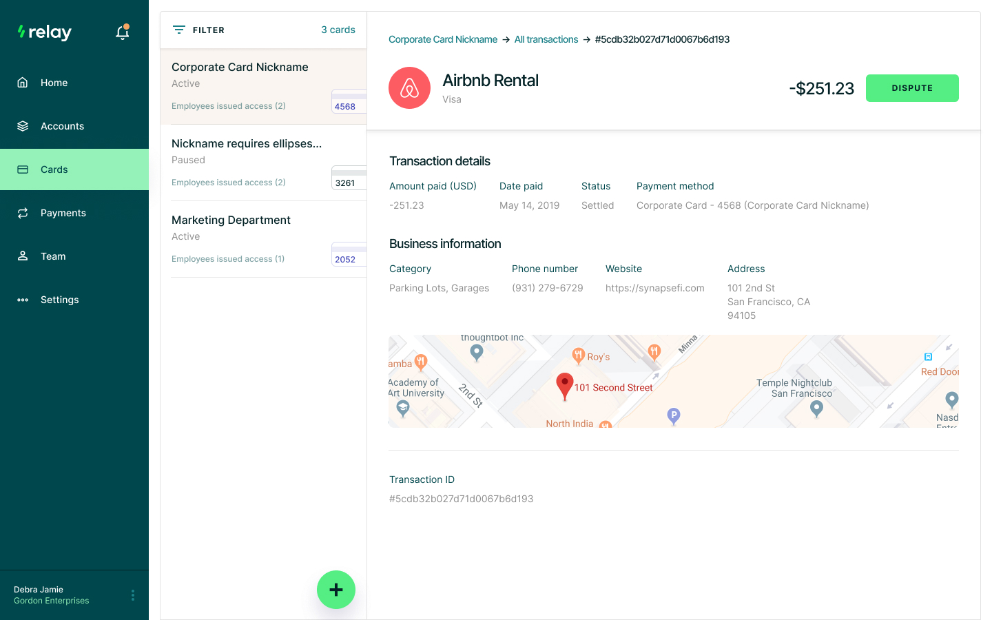
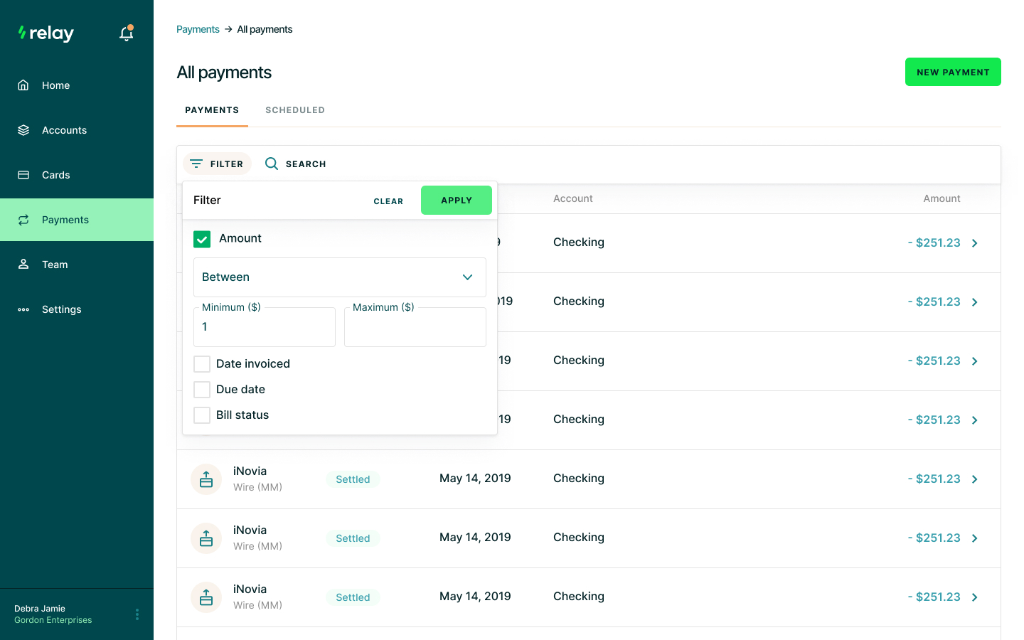
Quality of life improvements were made to how we issued cards, filtered through a data table and purchased third-party integrations.
All in all, it was a satisfying project to work on.
The founders were excited to work with me week after week—always a great feeling to hear from the team, especially when you are assisting on a contractor-level.
Soon after my engagement, a customer feedback was conducted and we had notably positive response come back. Here are some instances of what we heard:
“Relay Financial has been a great bank! The accounts are so easy to set up and support is always on top of things if you need it (which is rarely). I also appreciate how easy it is to set up virtual cards and add team members. Plus, they have now made transfers even easier, only needing one transaction for several transfers, which is helpful come disbursement time.”
“Hands down the BEST banking experience I've had for a small business like ours. Excellent bank feed integration with notes, fully virtual experience for account creation, virtual debit cards issued immediately, etc. It's just plain easy. Great product!”